Border
A Border is a container control that draws a border, background, or both, around another control. Border provides a very useful property call StrokeShape. This property allows us to modify the shape of the Stroke based on a Shape (Rectangle, RoundRectangle, Ellipse). With RoundRectangle, it enables us to control the radius of each corners independently.
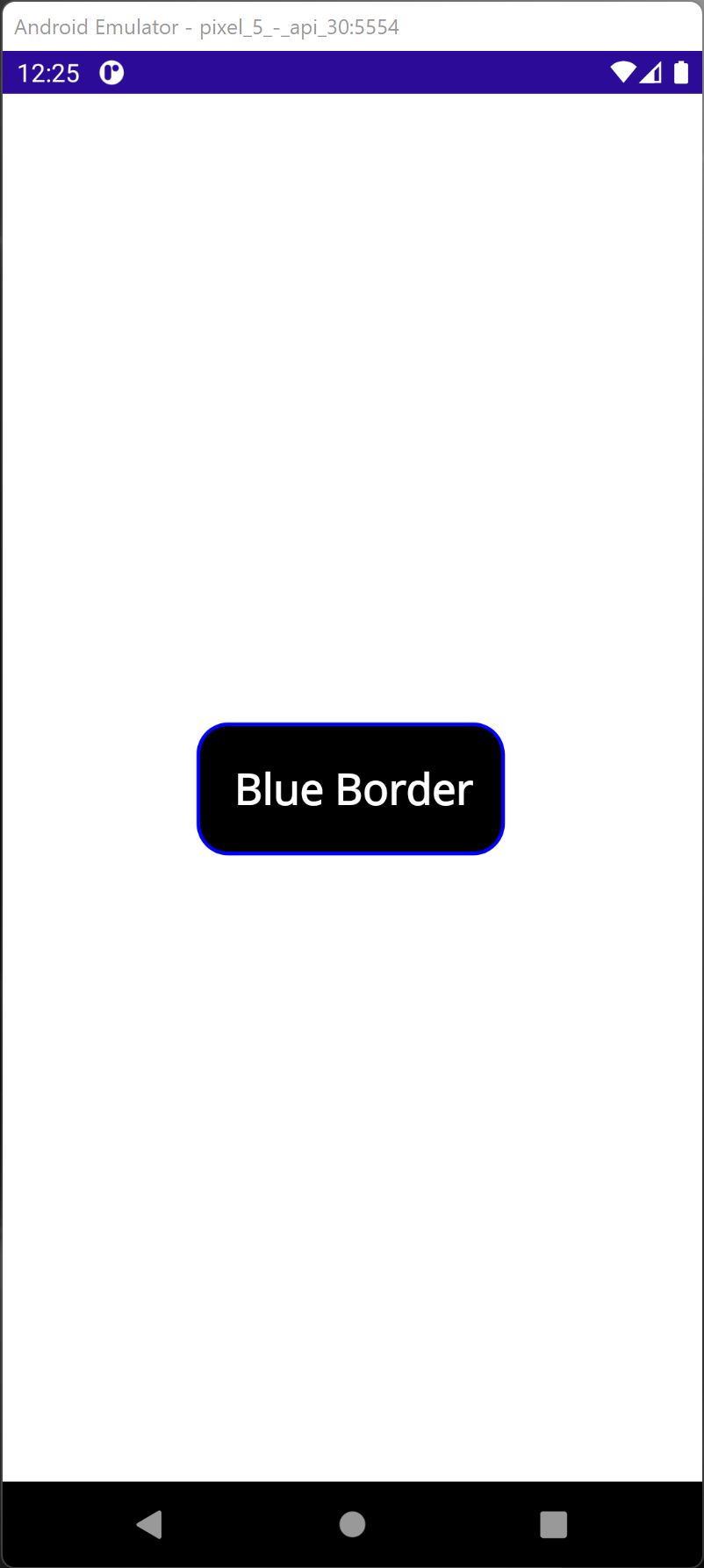
        <StackLayout VerticalOptions="Center"
                    HorizontalOptions="Center">
           <Border Stroke="Blue"
                   StrokeThickness="4"
                   Background="Black"
                   Padding="20"
                   HorizontalOptions="Center">
               <Border.StrokeShape>
                   <RoundRectangle CornerRadius="50,50,50,50" />
               </Border.StrokeShape>
               <Label Text="Blue Border"
                      TextColor="White"
                      FontSize="24"
                      FontAttributes="Bold" />
           </Border>
        </StackLayout>
A StrokeLineCap defines the shape at the start and end of the line path. It can be Round, Square, or Flat (Default).
- Flat represents a cap that does not extend past the last point of the line.
- Square represents a rectangle that has a height equal to the line thickness and a length equal to half the line thickness.
- Round represents a semicircle that has a diameter equal to the line thickness.
StrokeDashOffset is the distance between one dash line ending to second-line starting
StrokeDashArray="1,1"
StrokeDashArray represents a collection of double values showing the line and space patterns used to constrain the shape.
StrokeDashOffset="6"
StrokeThickness is the width of the shape outline
StrokeThickness="12"
Follow up on https://github.com/dotnet/maui/issues/3558
Download