FlexLayout
A FlexLayout is a control for stacking or wrapping a collection of child controls. When stacking the items, you can specify Direction, JustifyContent, AlignItems, and Wrap. The easiest way to understand FlexLayout is through samples shown below.
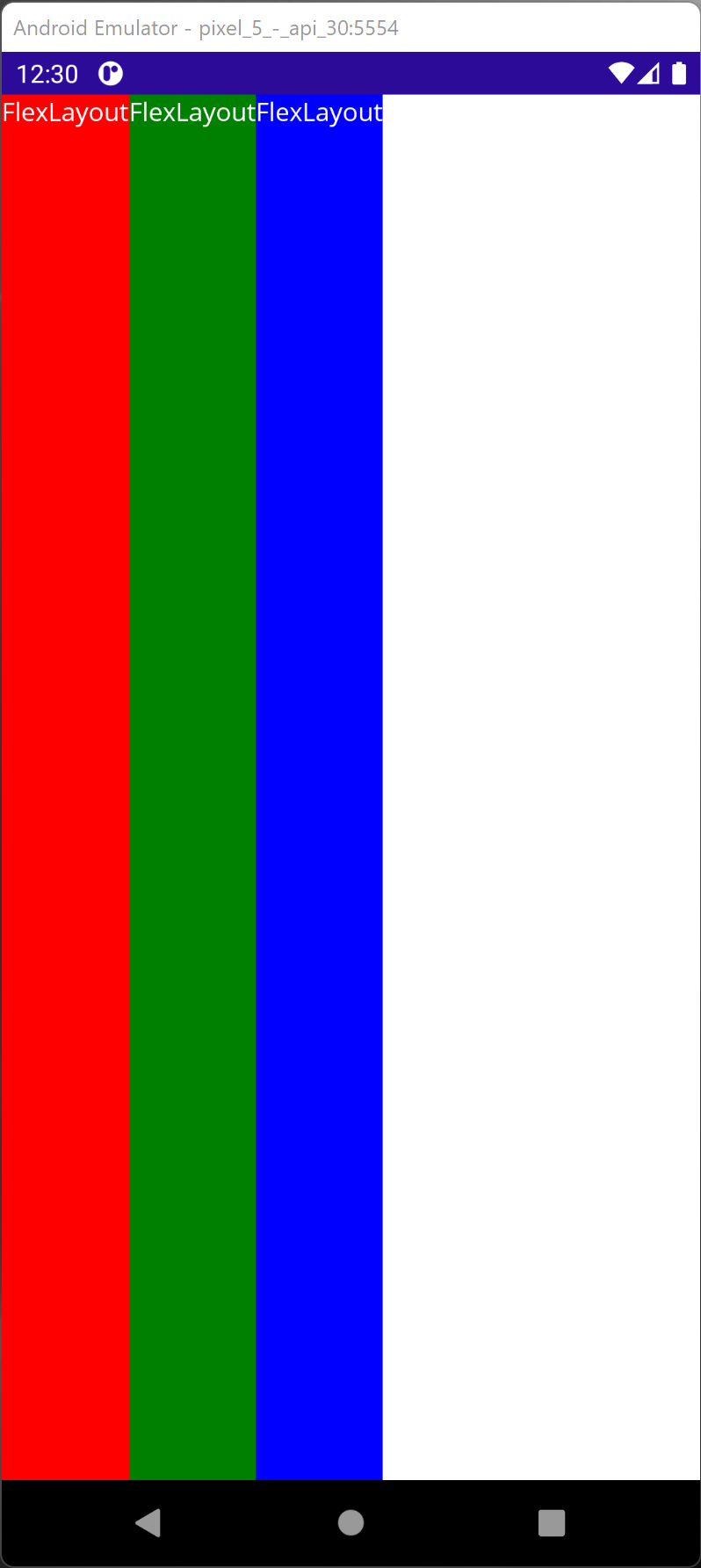
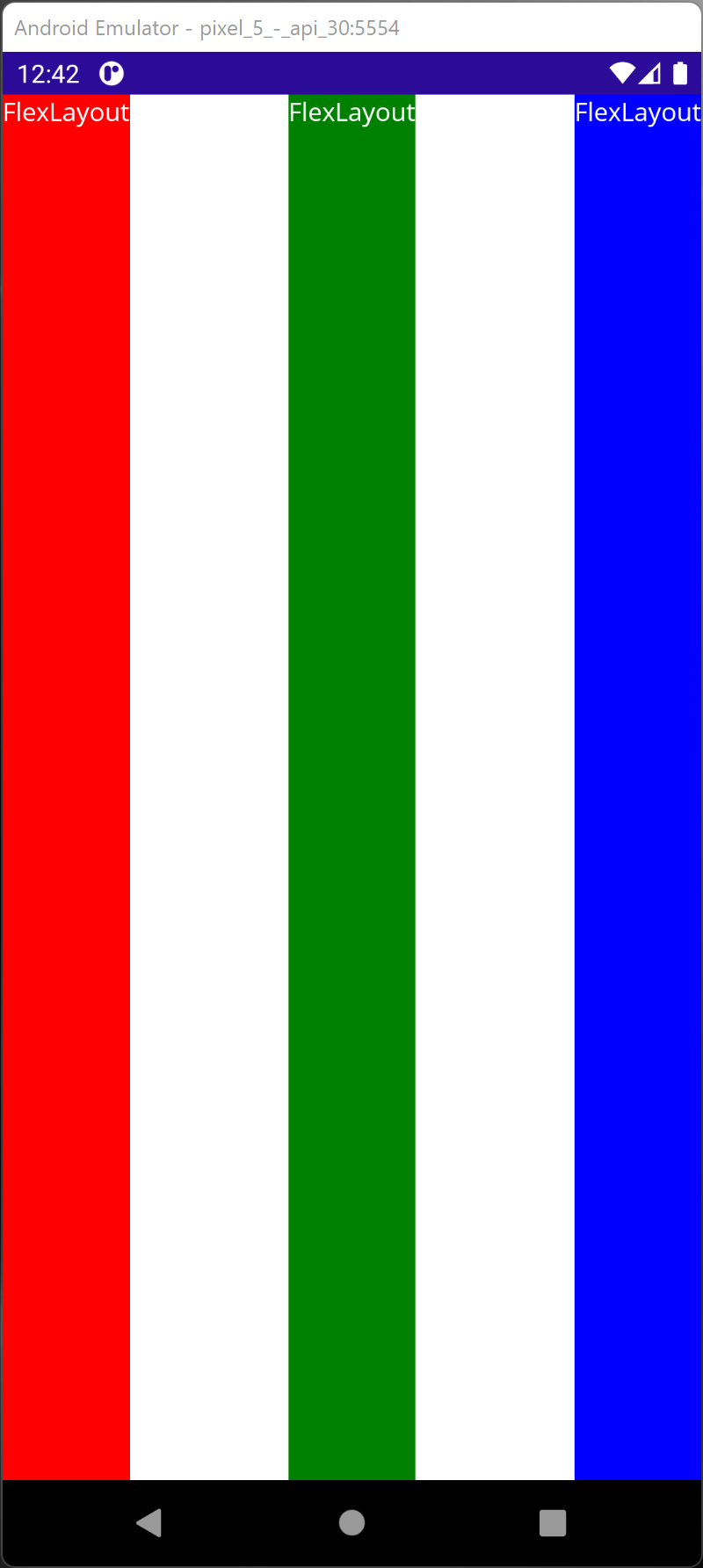
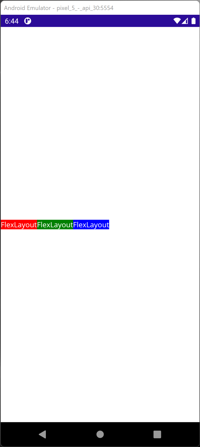
JustifyContent
JustifyContent describes how child elements are justified when there is extra space around them.
        <FlexLayout JustifyContent="Start">
            <Label Text="FlexLayout"
                    TextColor="White"
                    Background="Red" />
            <Label Text="FlexLayout"
                    TextColor="White"
                    Background="Green" />
            <Label Text="FlexLayout"
                    TextColor="White"
                    Background="Blue" />
        </FlexLayout>
- Start (Default) - At the beginning of the parent container.
- Center - Center of the parent container.
- End - End of the parent container.
- SpaceAround - Begins with one unit of space for the borders and two units respective to others elements in the container.
- SpaceBetween - Space between elements but no space at the beginning and end.
- SpaceEvenly - Space evenly between elements and at the beginning and end.
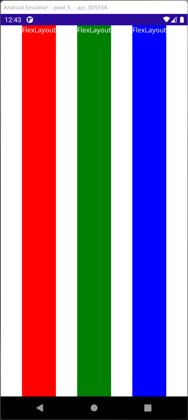
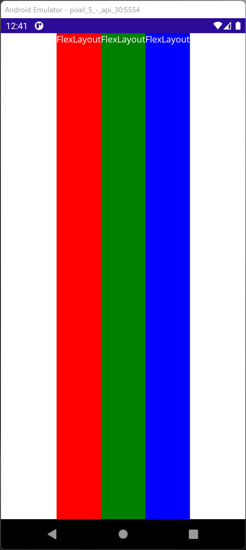
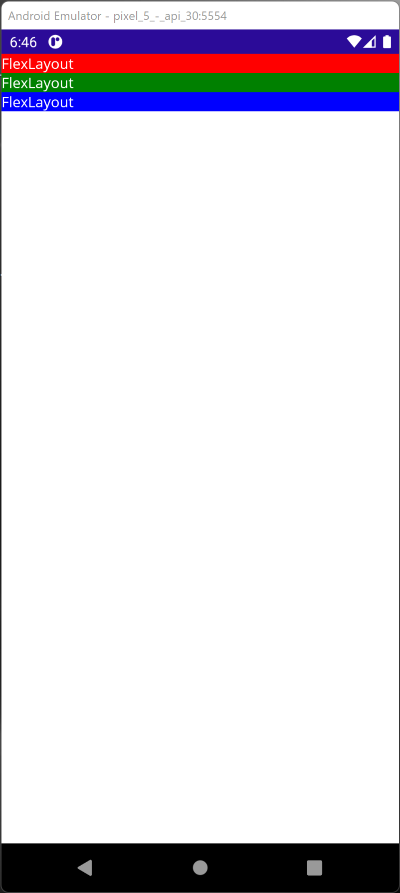
AlignItems
AlignItems describes the elements alignment in the parent container. Note that JustifyContent described the elements along the main axis while AlignItems described the elements perpendicular to the main axis.
        <FlexLayout AlignItems="Stretch">
            <Label Text="FlexLayout"
                    TextColor="White"
                    Background="Red" />
            <Label Text="FlexLayout"
                    TextColor="White"
                    Background="Green" />
            <Label Text="FlexLayout"
                    TextColor="White"
                    Background="Blue" />
        </FlexLayout>
- Stretch (Default) - Stretched to the height of the parent container.

- Start - At the beginning of the parent container.
- End - At the end of the parent container.
- Center - At the center of the parent container.
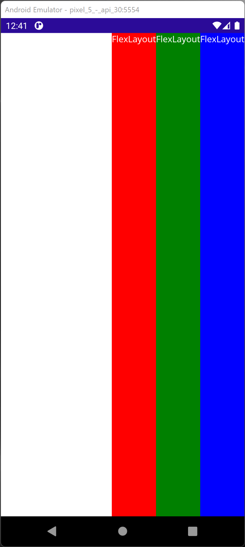
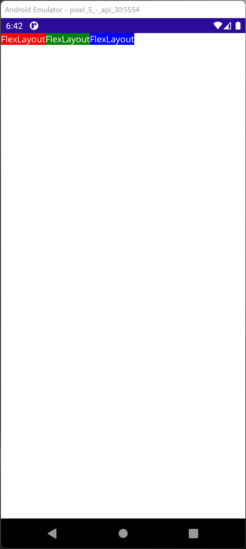
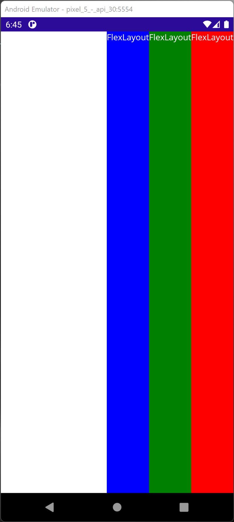
Direction
Direction indicates the direction of the elements with respect to the screen.
        <FlexLayout Direction="Row">
            <Label Text="FlexLayout"
                    TextColor="White"
                    Background="Red" />
            <Label Text="FlexLayout"
                    TextColor="White"
                    Background="Green" />
            <Label Text="FlexLayout"
                    TextColor="White"
                    Background="Blue" />
        </FlexLayout>
- Row (Default) - Left to Right.

- RowReverse - Right to Left.
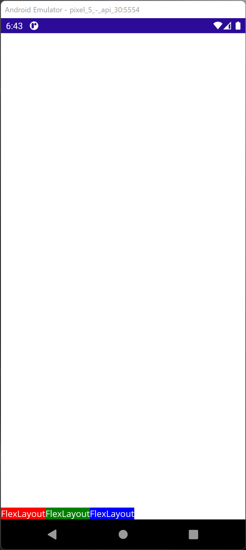
- Column - Top to Bottom.
- ColumnReverse - Bottom to Top.
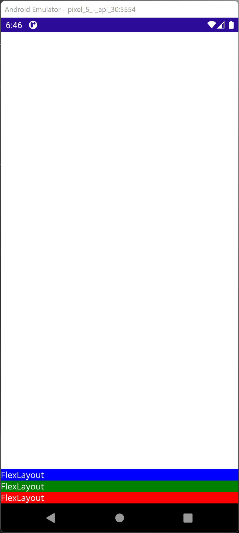
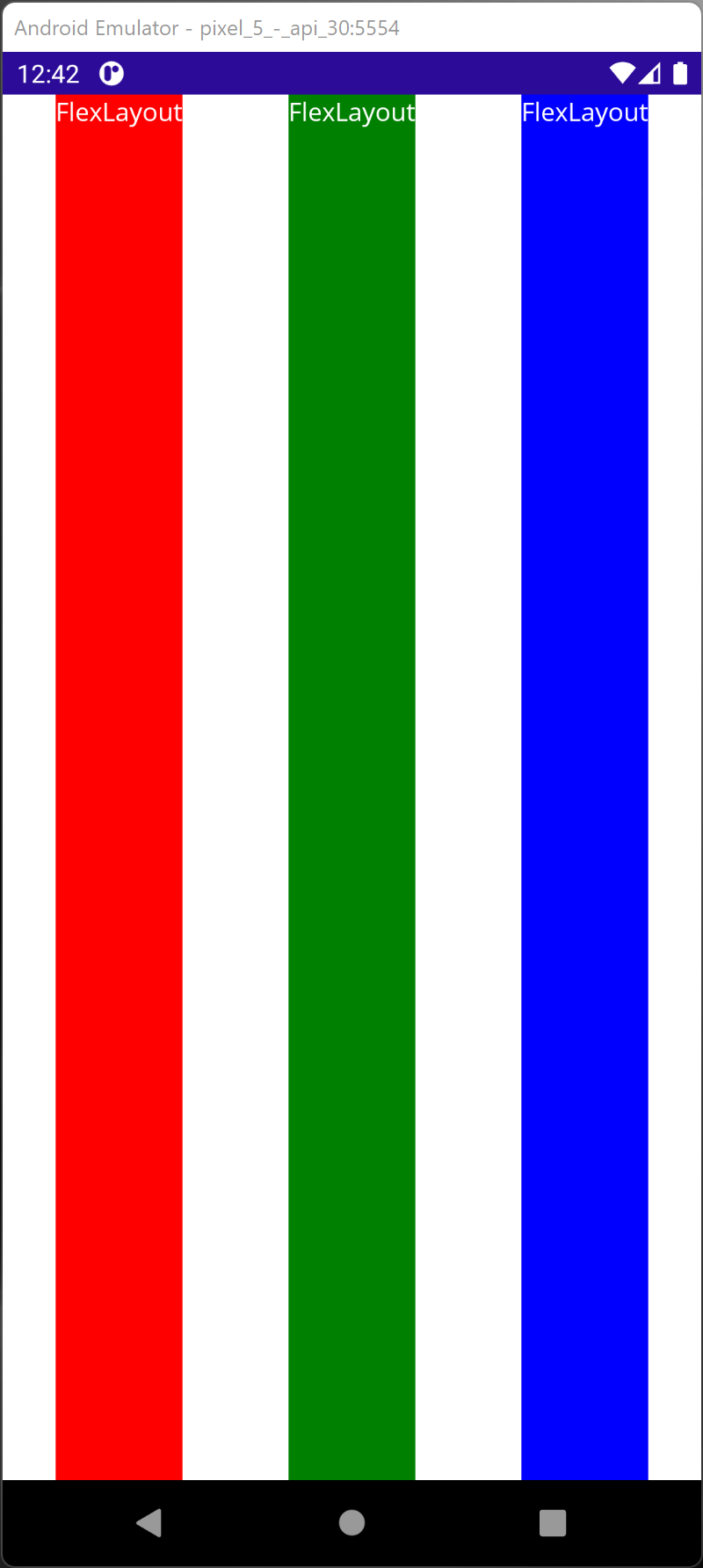
Wrap
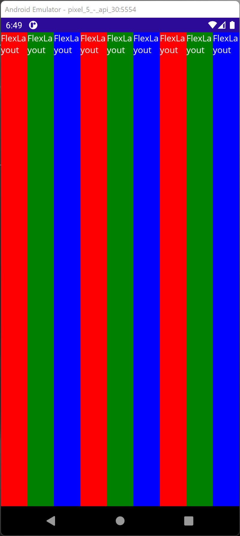
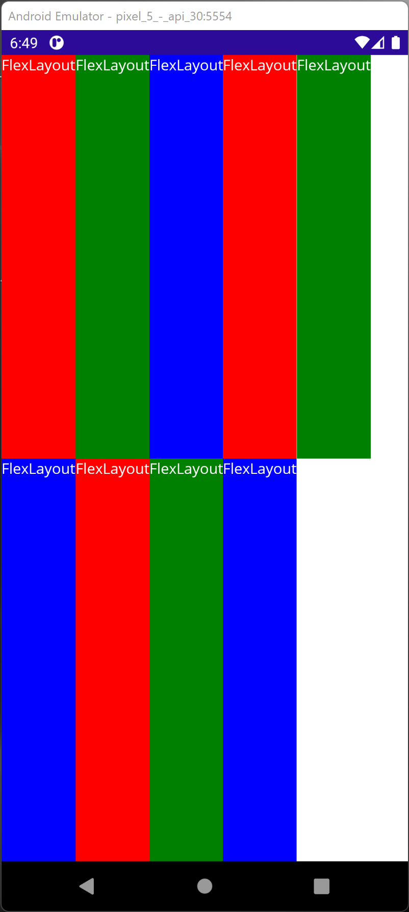
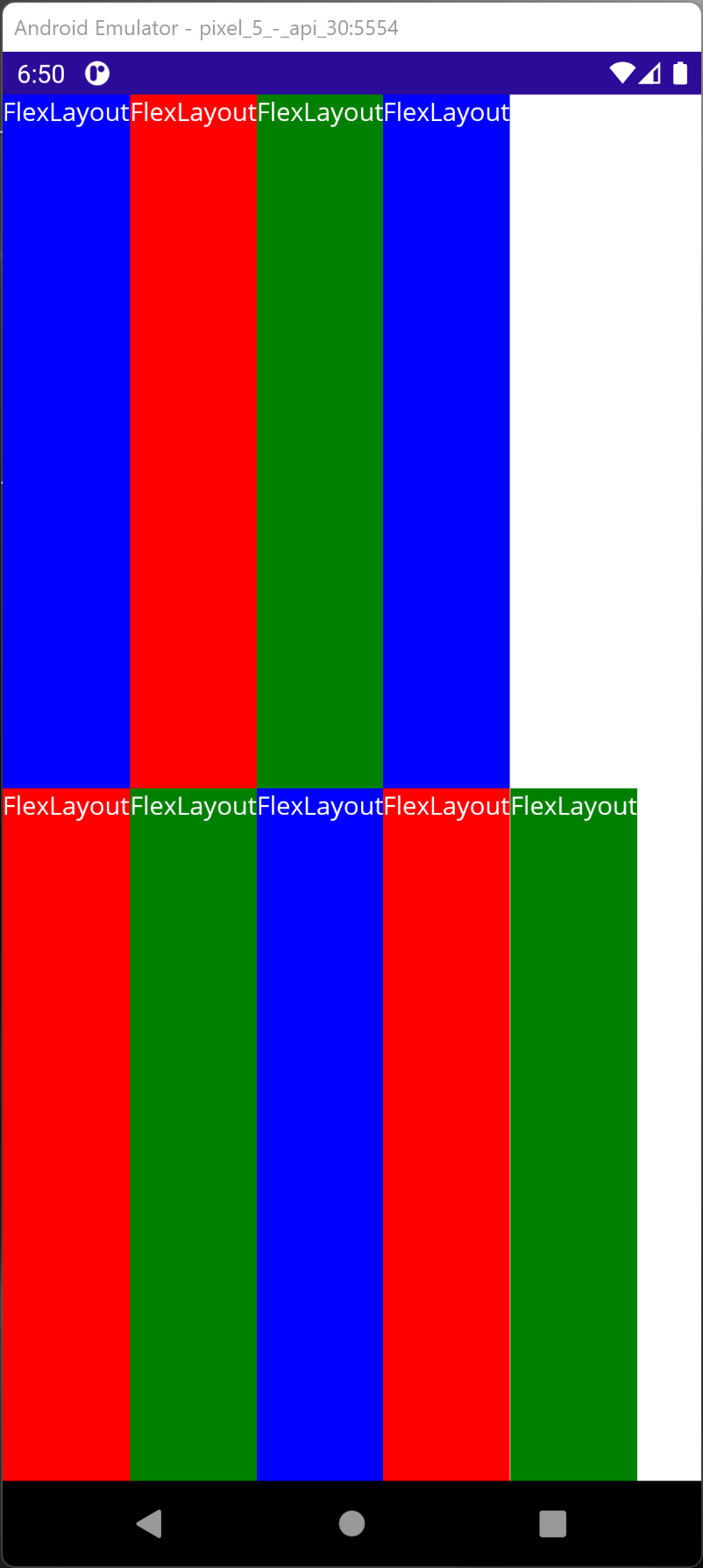
By default, FlexLayout layout the items in one single line without wrapping. In some layout, such as a layout for a photo album, it is useful to be able to wrap the items to the next line.
        <FlexLayout Wrap="NoWrap">
            <Label Text="FlexLayout"
                    TextColor="White"
                    Background="Red" />
            <Label Text="FlexLayout"
                    TextColor="White"
                    Background="Green" />
            <Label Text="FlexLayout"
                    TextColor="White"
                    Background="Blue" />
            <Label Text="FlexLayout"
                    TextColor="White"
                    Background="Red" />
            <Label Text="FlexLayout"
                    TextColor="White"
                    Background="Green" />
            <Label Text="FlexLayout"
                    TextColor="White"
                    Background="Blue" />
        </FlexLayout>
- NoWrap (Default) - All elements in one line.
- Wrap: All elements in multiple lines from Top to Bottom.
- Reverse - All elements in multiple lines from Bottom to Top.
Download